Wednesday, September 25, 2013

Chicks Run Wild

Back in April, I attended a Society of Children's Book Writers and Illustrators [SCBWI] conference in Houston, and learned so much about different aspects of the children's book industry from the great speakers, which included the Caldecott Honor Medalist, Peter Brown. By the way, if you haven't bought his new book, Mr. Tiger Goes Wild, you should. It's brilliant.

Peter Brown was one of the main reasons I wanted to attend the conference. I'm a big fan. But I didn't want to spend the money, and make the trek to Houston with two kids and a baby, and celebrate my middle child's birthday in a hotel room just to become some illustrator's groupie. I wanted to have some individual time with an illustrator, art director, or an agent to review my portfolio to see how I could improve it, or if I'm on the right track. The problem was that by the time I decided I could go the conference, the portfolio critiques were filled. So I called to see if I could weasel my way into one. I couldn't. But I did learn that there was a breakout session with an art director, Lucy Ruth Cummins, with an illustration assignment. Sold. I signed up that morning, and received the assignment a week and a half before the conference.

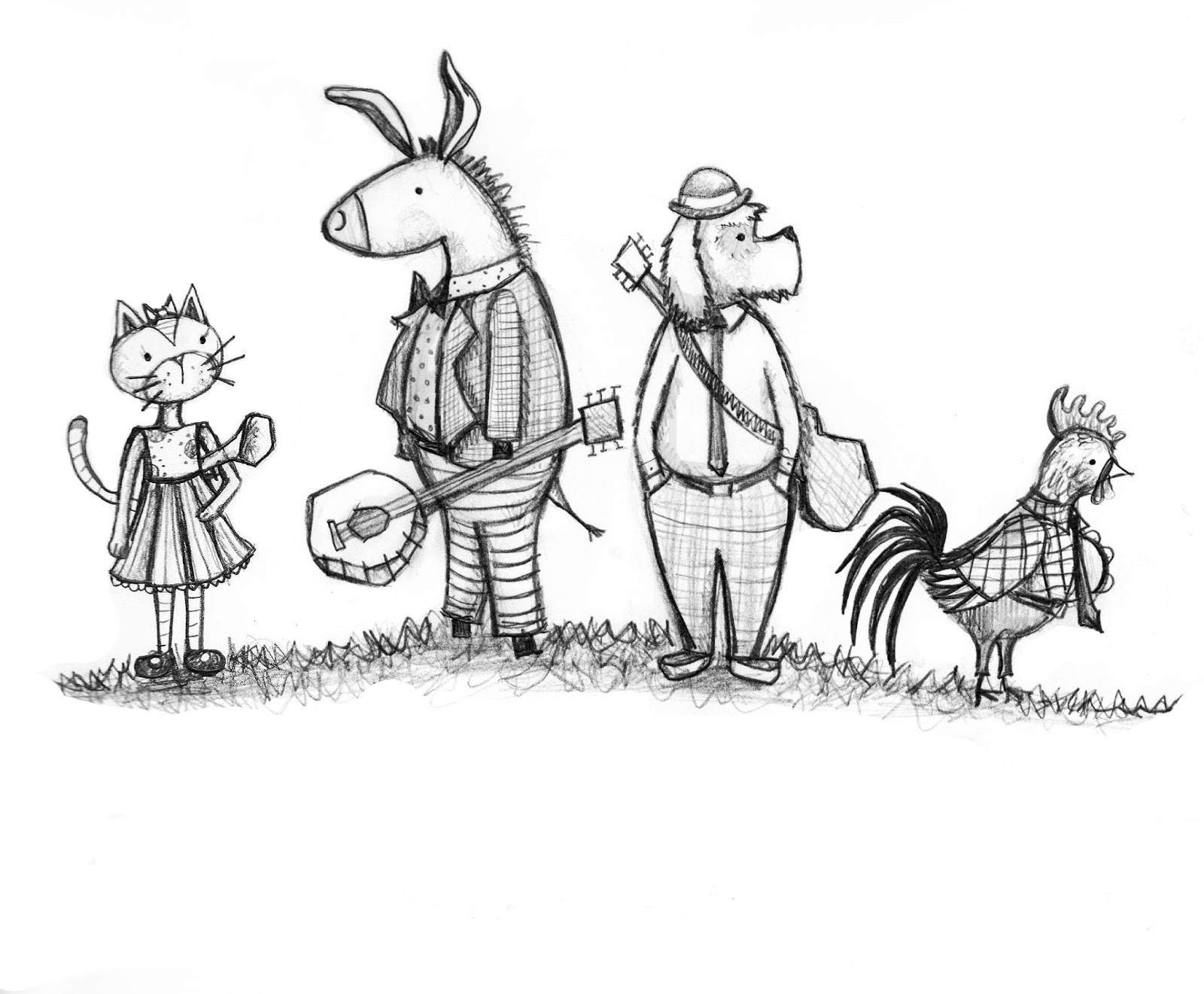
The assignment was to either illustrate a page from a picture book, Chicks Run Wild. This book had already been published, so I vowed not to look at it while I made my illustration because I didn't want it to influence my work in any way. I received the manuscript and started to plug away. After a lot of preliminary sketches, I finally settled on this:
I also made a color study in photoshop:

 At this point the sketches were emailed to Ms. Cummins, and I waited for her critique before I started on the final illustration.

I received her feedback the Monday before the conference, and I was thrilled. It was very good, and very informative. She loved the little chicks and their dot eyes, the colors and textures, the skewed perspective, and the dynamism of the swirled composition. She said it felt energetic, chaotic, and fun. She said the feathers looked more like leaves, she wasn't sure about the pink chick's hands, and she made note that I should avoid details that seemed overly digital, like the highlight on the chick's glasses. [Since I don't render my pieces digitally, I knew this wouldn't be a problem in the final].

I quickly began painting to get the final perfected before Saturday's conference. For times sake, I painted each element separately with plans to assemble them digitally. On Thursday night, I scanned everything into photoshop, but no matter how I adjusted the settings, the scans were overexposed. I tried to adjust the colors digitally, but they didn't look quite right. Frustrated, I gave up for the night.

So I hauled all of my art supplies to the hotel the next day, and armed with a pair of scissors, glue, and a dear mother-in-law to watch the kids, I set out to put my piece together, Kindergarten style. I painted in the details of the swirls and feathers and called it quits, with mixed feelings about the final.

At the breakout session, everyone displayed their pieces around the room, and Ms. Cummins gave her critiques one by one. When she got to my piece, I explained my plight with the scanner and that the picture would have been put together digitally. And her answer changed my whole approach to illustrating:

"WHY?"

She went on to add that she loved the dimensional effect, and would emphasize it even more. I can't tell you how relieved, excited, encouraged I felt at the end of the session. Since then, I've been physically assembling all of my pieces by cutting and gluing. Here's my final illustration:

 It's hard to see the dimensional effect here, but it's there. Except for the feathers and swirl, everything was painted separately and glued on in layers.

A funny thing, though, while making my preliminary sketches, I voiced my fear that I would create something that looked too much like the actual book illustrations. I didn't want to look like I copied the original work. Here's the actual cover:


I swear I never looked at the actual book until months after the conference. Ms. Cummins showed this picture at the conference, but it didn't even dawn on me that this was the actual book cover. When I did finally look at the book, I was shocked. It looks like I used this book as inspiration for my character designs. Oh well, what can I do?

Well, that's it for my novel about my new approach to illustration. 

xo
nessa dee 

Monday, September 23, 2013

The Metro...

These were from our trip to DC back in May. I love the backdrop the Metro creates. It makes for some really fun pics.


 And the very last picture we took in DC...

Kind of fitting, I guess.

Ah, memory lane.

xo
nessa dee

Thursday, September 19, 2013

Crafty Friday: Color Theory Abstracts

Yes, you saw that right. It's a Crafty Friday post! Since I'm teaching an art class on Friday to middle and high schoolers, I have to come up with lesson plans, projects, and samples. And since I have to make samples, I might as well share them on my blog. 

Since I've got a range of ages and skill levels in my class, I wanted to give them a few basic lessons to help prep them for what's to come. Knowing color theory will be quite useful in some of our projects, so we worked on color mixing and theory with this project, which is a little more fun than just making a color wheel.

First, if you're not familiar with color theory, you can check out this lesson here

You will need a large square piece of paper [I used 12x12"], with two lines dividing the square in half vertically and horizontally to make four equal quadrants. You will also need a smaller square the size of one of  the quadrants [in this case, 6x6"]. On the smaller square, draw a design consisting of shapes, lines, simple objects. The key is to not over complicate the design because you will be painting each part in different shades of color. Here's what I came up with:


If you need some ideas, here are several design samples:

The next step is to transfer your design into each of the four squares on your larger piece of paper. If you don't have a light box to use, you can do this by taping your small square onto a light filled window, and holding your larger paper over the design so you can trace it onto your piece. Once the whole paper is filled, you're ready to start painting. 

The first square will contain a monochromatic color scheme, which means one color. Pick a single color to work with [I chose blue], and make tints by adding white, or shades by adding black. Paint each of your shapes in a variety of tints and shades.


The next square will be filled with analogous colors [colors that are next to each other on the color wheel]. I chose red-orange, orange, yellow-orange, and yellow. 


The last two squares I filled with complimentary colors [colors opposite each other on the color wheel]. I chose to work with purple + yellow and green +red. [The third combo is blue + orange]. I made tints and shades of each color and filled in the remaining squares. And the end result is a nifty abstract art piece:

I got the idea for this lesson from a blog called Art Confidence. Check it out for more great examples of this project.

Happy Crafting!
xo
nessa dee

Monday, September 16, 2013

Why I want to make picture books


xo
nessa dee


Thursday, September 12, 2013

Embrace


I posted this painting last week in a series of pictures, but I wanted to give you a little more of her story. This is a concept for a page in the book I've written. I'm currently shopping for a publisher who's willing to take on this little project of mine, and in the meantime, I'm trying to paint a few more final illustrations.

What I'm sending out is a dummy book of my story which is a mock up of what I envision the words and pictures to look like published. The dummy book isn't a full color print out of final illustrations, but rather a small black and white book of detailed sketches. I've completed several of the final illustrations from my sketches, but I don't want to complete all of them yet because if it does get picked up, the book might end up going through a lot more changes. That being said, this illustration is one that's already gone through a metamorphosis. It started out looking like this:

I liked the close up of the mom here, but the scan was bad, and I thought it needed a bit of photoshop magic, so it became this:


[Just to note: The huge blank side of the page houses the text.] 

I liked this enhanced version, but I started to wish I could see the baby's face. I also wanted to soften the mother's appearance a bit. That lead to this sketch:


Which lead to the final:

I create my backgrounds and page elements separately, and put them together later, not in photoshop, but with glue, or tape. This way of making my illustrations came about as a fluke, which I'll tell you about in a different post, but it's been a time and sanity saver. It also creates a neat dimensional effect with the shadows. 
I'm not sure if she's completely finished, but she's mostly there.

xo
nessa dee

Monday, September 9, 2013

Freckle Face

I used to hate my freckles. I have a face full of them, and as a young girl, I just wanted them to disappear. I looked at the flawless skin that graced the covers of magazines and longed for a clear complexion, free of spots. 
My face was flawed.
My parents liked my freckles. My grandparents thought they were cute. I couldn't understand why anyone would like brown spots covering what would have been decent skin. And there was this one freckle on the side of my nose that I particularly despised. It was big... no HUGE, a monstrosity that just ruined my face. For some reason, though, every time I walked down the street to visit my grandparents, my PaPa Jack would make it a point to give me a kiss right on that giant freckle. He would make a big deal out of looking for that special freckle, the one that belonged to him, and when he finally found it, he would plant a kiss right on that huge flaw. 

After a while, although I still wished it wasn't there, I didn't mind it quite so much.

I used to hate my freckles
...until I had kids of my own, and all of those years of wondering why my parents liked my freckles, why my grandparents thought freckles were cute, and why my grandpa loved that one particular freckle on my face finally made sense.

I adore these freckles...

These freckles are so cute...

And don't ask me how many times I've kissed that one freckle on the side of this little boy's cheek...


I love them because they are a part of these faces. They are like sprinkles on top of an ice cream sundae...they just make it a little sweeter.

My own freckles have faded over the years, and that one freckle, that monstrosity on the side of my nose is getting harder to see. But oh, how I hope it won't fade away. I never knew how much good could be wrapped in what I once considered a flaw. It was made special, and every time I see it, I smile.

xo
nessa dee

Thursday, September 5, 2013

Travelling Musicians

Just a quick post to pop in, say hi, and show you a sketch. 
I've been settling into our new school schedule, but Labor Day threw me off quite a bit. It's also been quite an adjustment with a very active toddler in the mix. I'll get back to my regular blog posting soon, but if you want to check out some of our goings on you can look at my Instagram page, or follow me on Twitter for few there as well.
And just for the grandparents...


xo
nessa dee